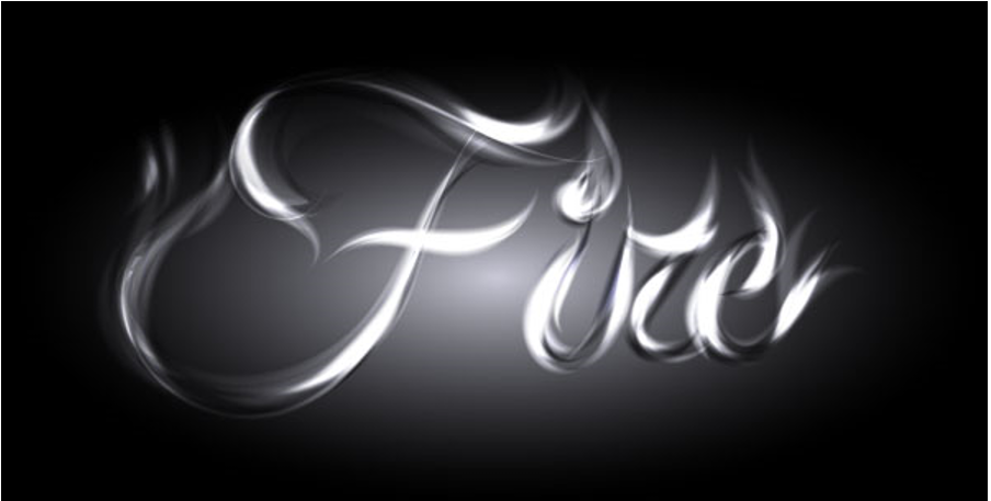
How to Fire Up Your Designs Using This Awesome Vector Fire Text Effect
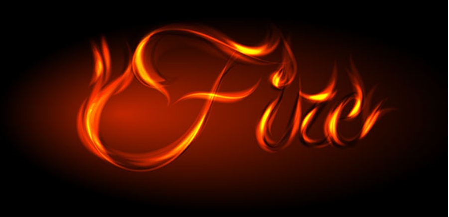
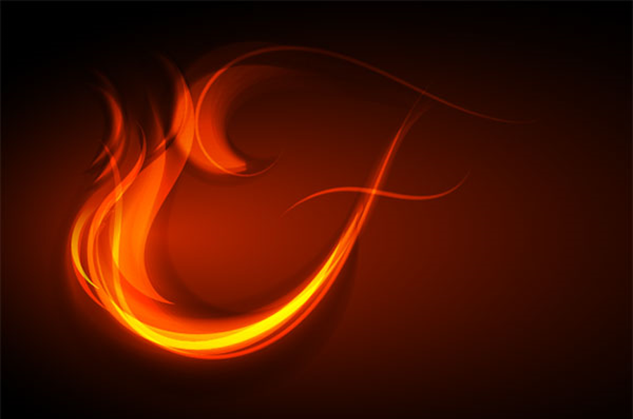
Final Image
Step 1
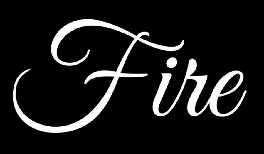
Start with the Type Tool, and type Fire, using a font you feel will work for you.Here a a script font was chosen as it allows for the flames to move into each other. Lock the text in the Layers panel.
Step 2
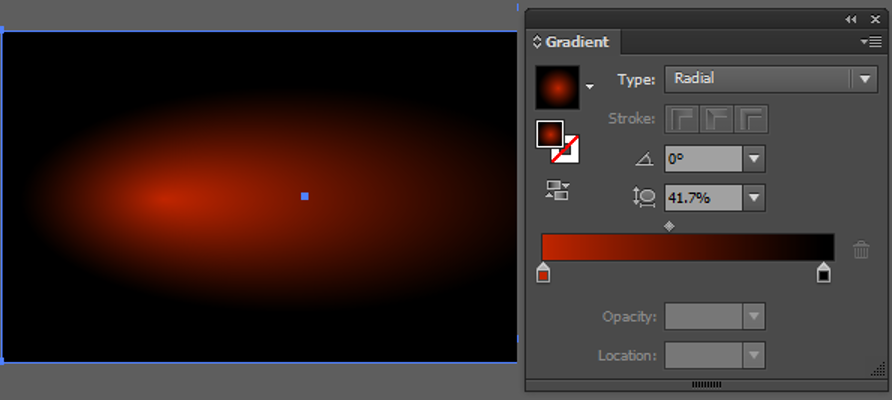
Using the Rectangle Tool, draw a large rectangle covering the artboard. Apply a Radial Gradient going from black to a burnt orange. Adjust the gradient’s shape with the Gradient Tooland its other attributes in the Gradient panel. In the Layers panel, set this rectangle below the text layer and lock this shape to keep your workspace organized.
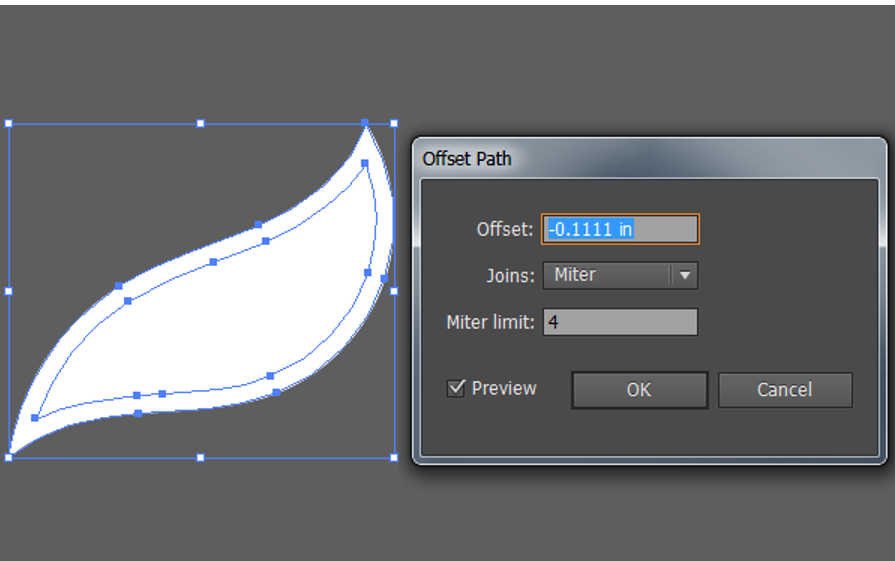
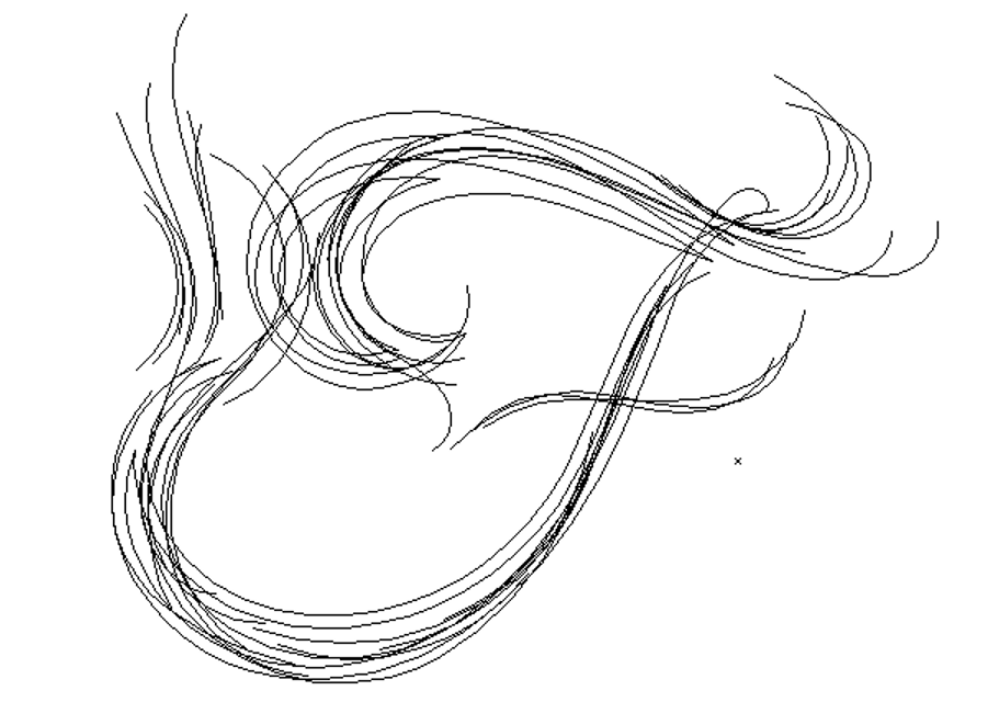
Step 3
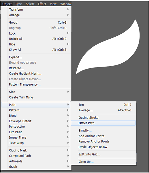
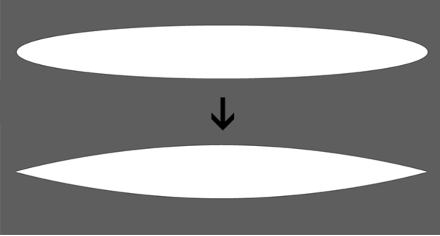
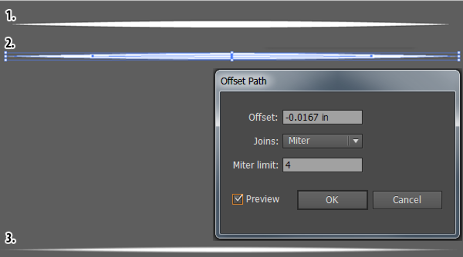
One of the main techniques we’ll be using in getting this fiery effect is creating blurred-like shapes with the Blend Tool. But first, we’ll need to draw our shapes we’d like to blur. So use the Pen Tool or Pencil Tool to draw a wispy leaf-like shape. Then select it and go to Object / Path / Offset Path…
Step 4
When the dialog box pops up, hit Preview and set the offset to -6px or -8px. Hit OK once you’re satisfied with the size of the new interior shape you’ve made.
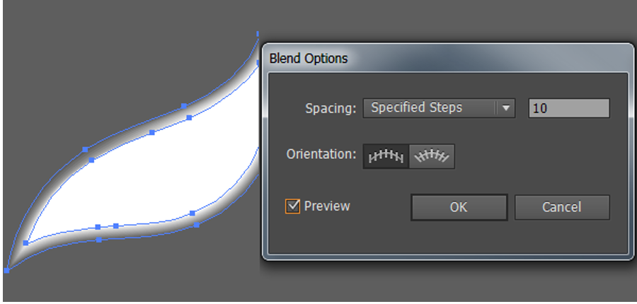
Step 5
Select the larger shape and reduce the opacity in the Transparency panel to 0%. Select both shapes and with the Blend Tool, select their paths. In Blend Options (hit Enter with the Blend Tool selected) adjust the steps of the blend to 10 or 12. Hit OK when you’re satisfied with the smoothness of the blend.
Step 6
Next we’ll start applying the technique outlined in Steps 3-5 to our text. Draw a thinned, wispy shape along the bottom of the F in fire.

Step 7
Repeat the process from Steps 3-5 in order to create a smooth blend.
Step 8
Change the Blend Mode of the blended shape in the Transparency panel to Overlay.
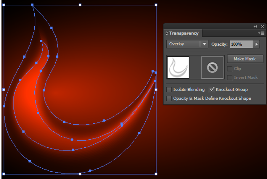
Step 9
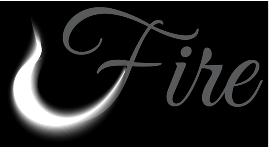
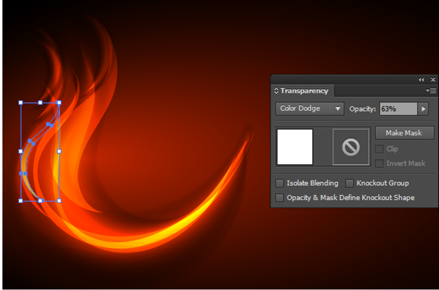
Repeat these steps creating fiery shapes, layering them up. Play with the opacity and blend mode settings as you see fit (changing from Overlay to Color Dodge or Lighten). In the example below, I drew each shape with the Pencil Tool, repeated Steps 3-8, and set each object to Overlay in the Transparency panel.
For the more opaque shapes (see the selected one below), I simply drew them with the Pencil Tool, lowered the opacity to 63% (this is arbitrary — set it to your liking), and set the blending mode to Color Dodge. Arguably, these brighter, more opaque, less blended shapes are a bit more stark in the design and are to be used sparingly when creating realistic fiery lettering.
Step 10
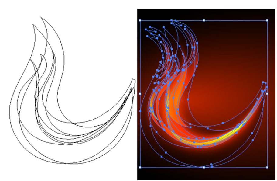
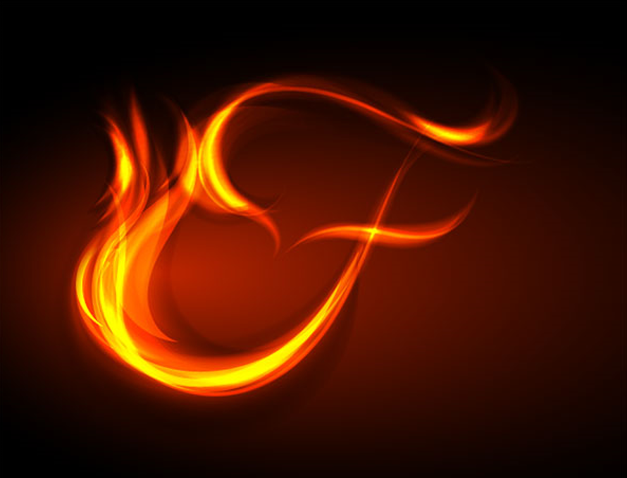
Once you’re satisfied with your flames, select then and Group (Control-G) them together flames. Below you’ll see the Preview Mode toggled (Control-Y) between Outline and Preview. This is just to show you how simple the design is in terms of vectored shapes versus having rasterized pieces or expanded effects.
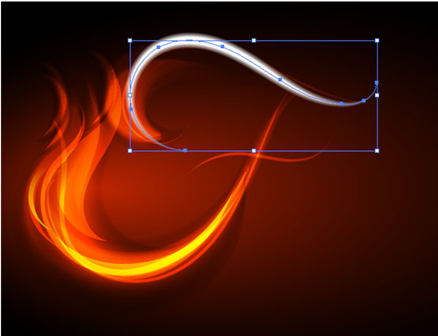
Step 11
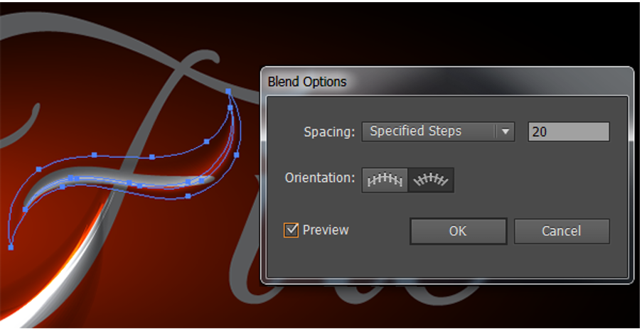
Next, apply this same technique outlined in Steps 6-10 to create the fire effect to the letter “F”. Play with the number of steps in the Blend Options. For the horizontal line in this letter, the blend is between a larger shape , so we’ll set the offset shape at 20 steps (see Steps 3-4 for offsetting shapes). Doing so creates a smooth gradient-like blend. If you choose less steps for the blend, the inner shape won’t recede into the background as smoothly.
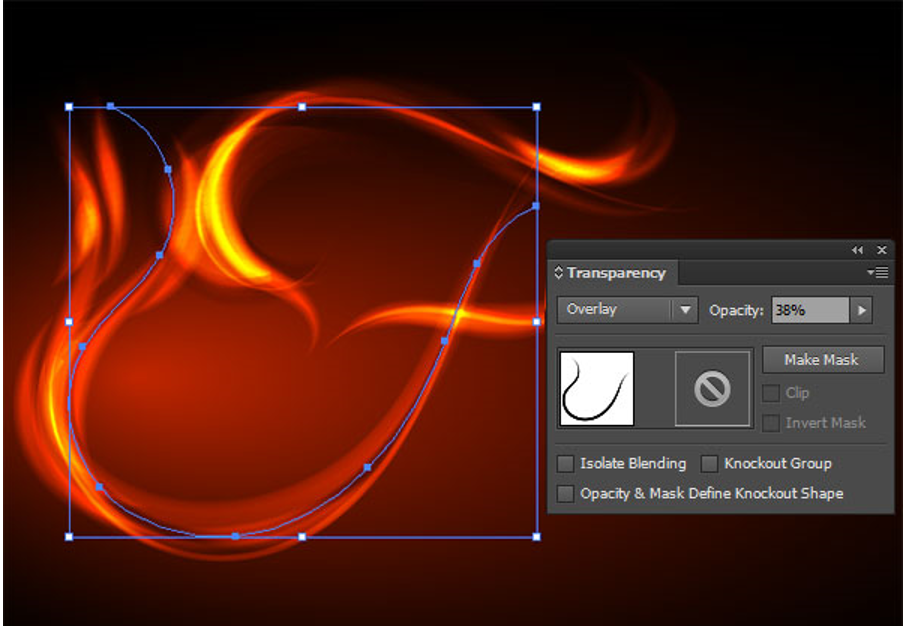
Step 12
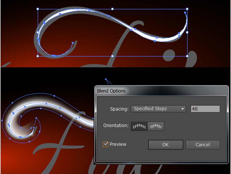
Moving along to the top of the F, set the blend at 40 steps. The wider the margin between the interior and exterior shapes within the blend, the more steps are needed to keep it smooth and gradient-like. Otherwise, it’ll be very obvious that it’s essentially multiple shapes layered on top of each other at varying levels of transparency.
Step 13
Another method of designing the fiery shape and paths for this text treatment involves creating a simply custom art brush. Start with the Ellipse Tool (L) and create a long, horizontal ellipse. Use the Convert Anchor Point Tool (Shift-C) on the right and left anchor points of the ellipse to bring them to points (rather than remain rounded).
Step 14
Use the Scale Tool (S) to squish the ellipse down so it’s thin. Much like the blending technique from above, select the ellipse and go to Object/Path/Offset Path…. Offset the ellipse by 1-2px (make sure its negative, as you want the new shape to be smaller). Reduce the opacity of the larger shape to 0% and use the Blend Tool to create a smooth blend between the tool (again just like Steps 3-5).
Step 15
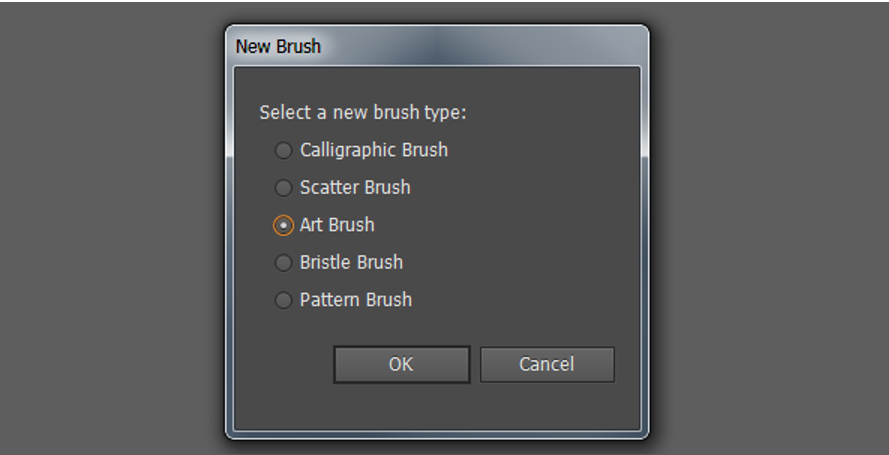
Select the newly blended shape, and in the Brushes panel, hit New Brush in the panel’s options. Choose Art Brush from the list and hit OK.
Step 16
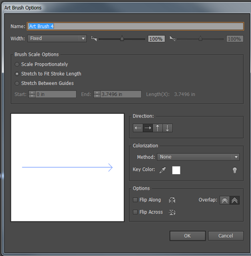
This brush is fairly simple, so the default options seen below will work just fine. Make sure the Direction of the brush is going to the right.
Step 17
With your new brush selected, draw on top of your text with the Paintbrush Tool. Make sure to set each stroke to Overlay or Color Dodge in the Transparency panel.
Step 18
Adjust the stroke width in the Strokes panel to your liking. You can also adjust the stroke with the Width Tool in case you don’t have a pressure sensitive tablet.
Step 19
Continue layering white blended shapes and strokes (with the new brush) so your fiery shapes burn bright.
Step 20
You can also create a black version of the art brush from Steps 13-16 that is set to Overlay or Color Burn in order to give your fire some depth by creating shadowed components. Adjust the Opacity of each stroke to your liking as well, as you want the fire shapes and paths to be gradual changes between their layers.
Step 21
Alternatively, you could use only brush strokes for the fire look. Seen below for the F in Outline Preview Mode. This makes smaller shapes overall, but also requires more layers in order to cover larger spaces and create brighter spots of fire.
Step 22
Continue using the font from Step 1 for drawing strokes and blended shapes of fire for the rest of your text. I suggest layering black shapes (set to Overlay) underneath white pieces (set to Overlay or Color Dodge). As you create bits of “fire,” consider the direction of your flames and how you wish for your pieces to appear to be burning. In this case, they’re pulling upwards and largely to the right of the picture plane. I’ve also concentrated most of the bright layers on the curves of each letter.
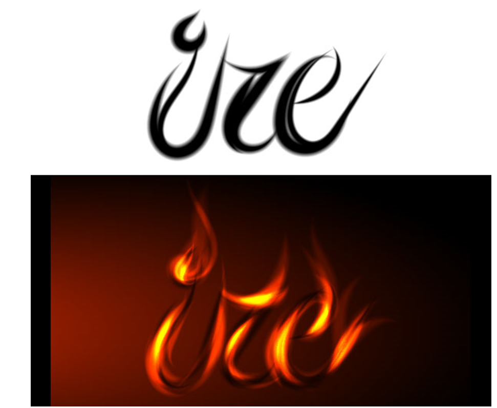
Step 23
If you change the color of your background gradient, you’ll change the color of your entire piece. This can lend to creating smoke-like letters, blue fire or assorted rainbow gradients of fiery words.
Group together your letters when you’re satisfied with your text, and prepare your file for whatever use you may have for flaming text.
The final product.