How to Create an Abstract Topographical Map Icon
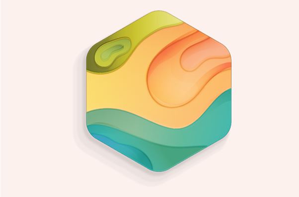
Final Image: Abstract Topographical Map Icon

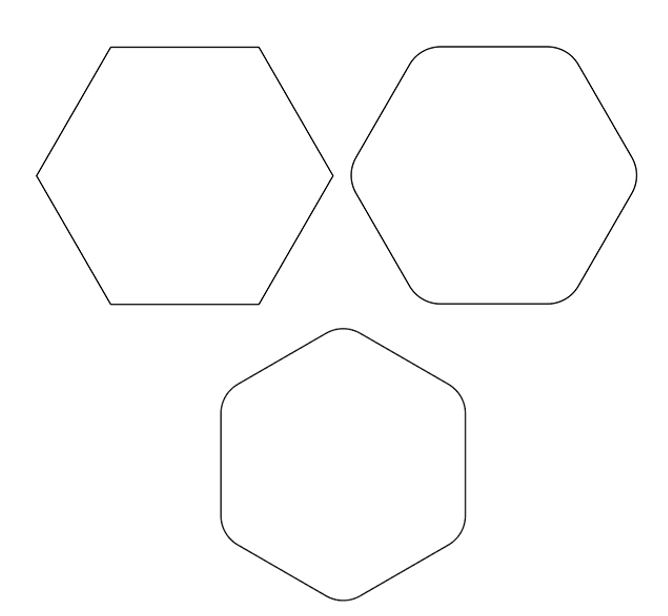
Step 1
Let’s start with a simple geometric shape. I’ve drawn a hexagon with the Polygon Tool. Round out the shape by pulling its Live Corners toward the center. Rotate the shape to its side if you with to match mine below.
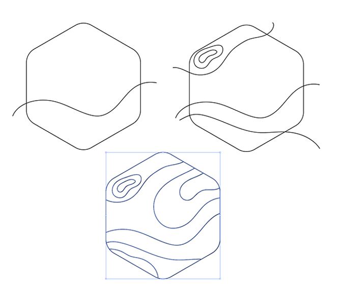
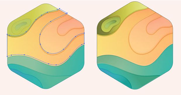
Step 2
Using the drawing tool of choice, draw some wavy stroked paths across your geometric shape. I opted to use the Pencil Tool with its Fidelity set to Smooth. Select all of your lines and frame shape and hit Divide in the Pathfinder panel. Now your geometric shape will be separated into sections.
Step 3
Decide on your color palette. Since this is like a map, you may want to consider different colors found within terrain. I decided to go for grass, sand, and water which translated to greens, oranges, and blues. Each shape will be a Linear Gradient shape, so choose light and dark colors for each.

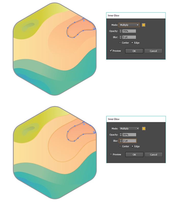
Step 4
Once you’ve set your shapes to gradients, it’s time to make them pop from the rest of the design. Select a shape and in the Appearance panel go to Effects > Stylize > Inner Glow to add aglow with the following attributes:
- Mode: Multiply
- Color: Orange (or yellow)
- Opacity: 75%
- Blur: 5 pt
- Edge
Play around with inner and outer glows on these shapes. Add multiple instances to one shape or simply add one. Here’s another Inner Glow alternative:
- Mode: Multiply
- Color: Orange (or yellow)
- Opacity: 50%
- Blur: 2pt
- Edge
Step 5
After you’ve added inner glows to each shape, you may want to add more dimension to the map. I Copied (Control-C) and Pasted (Control-V) each shape, set their Blending Modes to Overlay and reduced their transparency in the Transparency panel. I then offset each shape so it looks like each shape has a second plane and it slightly 3D.
Step 6
You may want to simply draw gradient shapes to add a cast shadow onto each map shape. I used black and white Linear Gradients whose Blending Modes were set to Overlay, Soft Light, or Color Burn depending on how it looked. Play around with these Blending Modes to created the rendered icon that looks best to you!
Group (Control-G) these rendering shapes together. Redraw the original hexagon created in Step 1 of this tutorial. Select the group and the hexagon and create a Clipping Mask (Control-7).

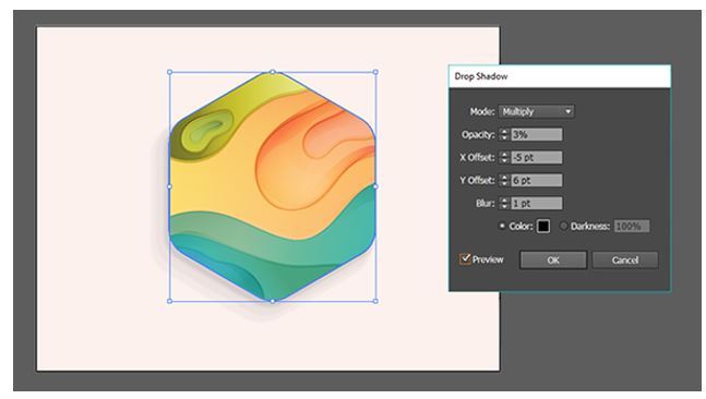
Step 7
Finally, select your icon group and add a Drop Shadow (Effect/Stylize/Drop Shadow) with the following attributes:
- Mode: Multiply
- Opacity: 3%
- X Offset: -5 pt
- Y Offset: 6 pt
- Blur: 1 pt
- Color: Black
I created three instances of this Drop Shadow within the Appearance panel. Doing so created a multi-level drop shadow that mimics the look and feel of the icon design itself.
Conclusion
Great job, you’re done! Share your completed icon in the comment section below. Consider creating different kinds of terrain for your icons: deserts, oceans, forests, mountains, and more!