How to Create a Custom Water Font
Resourced from:
Create a Custom Water Font
In this tutorial, you’ll learn how to create a water-inspired font style. We’ll base the water font either on your handwriting or a brush font, create custom brushes, play with blending modes, blended shapes, gradients, and vector effects in the Appearance panel to keep your font face flowing!
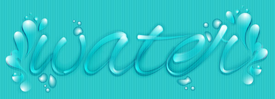
Final Image
Step 1/.
To start, choose a blue or turquoise hue for your background color and use the Rectangle Tool to draw a large rectangle over the entirety of your artboard. Then choose a brush script that you like to write out the word you’ll be “liquefying”. In this example the font Alex Brush was chosen because it lends itself wonderfully to watery text. But the font Brush Script MT Italic which is in Illustrator is also worth trying.

Step 2
There’s two methods you can use for creating flowing, liquid letters.
The first starts with drawing a circle with the Ellipse Tool (L) at the top of your first letter (or at one of the thicker points in case you’re using an alternate font). Rotate the circle so its top and bottom anchor points line up with the direction of the letter (see below). Using the Direct Selection Tool (A), pull the bottom anchor point downward along the length of the letter’s side. In the case below, it’s the W’s first leg.
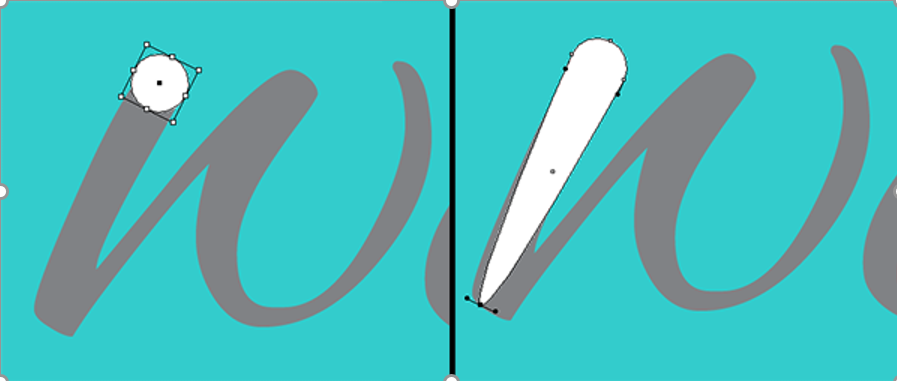
Step 3
Use the Convert Anchor Point Tool to bring the end of the elongated circle into a point. Repeat Steps 2-3 for the other legs of the W. For curved portions of letters, start with a circle again at the thickest part of the letter’s stroke and pull the bottom anchor point down, with the direct Selection Tool, to the bottom of the letter (initially ignoring the curve, as seen below).
Then adjust the handles of the bottom point so the shape curves in accordance with the letter. You’ll have to manipulate the handles of the other points as well in order to get the right curve, depending on your letter and font. If the handles don’t appear, use the Convert Anchor Point Toolto convert it into a curving point. Do this by clicking on it once or twice. You’ll notice anchor handles pop out immediately if it was previously a point.

Step 4
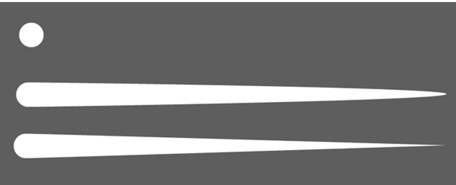
AS mentioned in Step 2, there being two methods I like for constructing letters for this tutorial. The first was covered in Steps 2-3. the second method starts with a circle drawn with the Ellipse Tool.
Use the Direct Selection Tool and pull the right anchor point out to the right of the picture plane. Make sure to bring its end to a point using the Convert Anchor Point Tool.
The size of your circle and final shape as seen below will depend on how large of strokes you’ll need to draw for your lettering. A good guide for this is to draw the circle over your text as we did in Step 2 to gauge size.
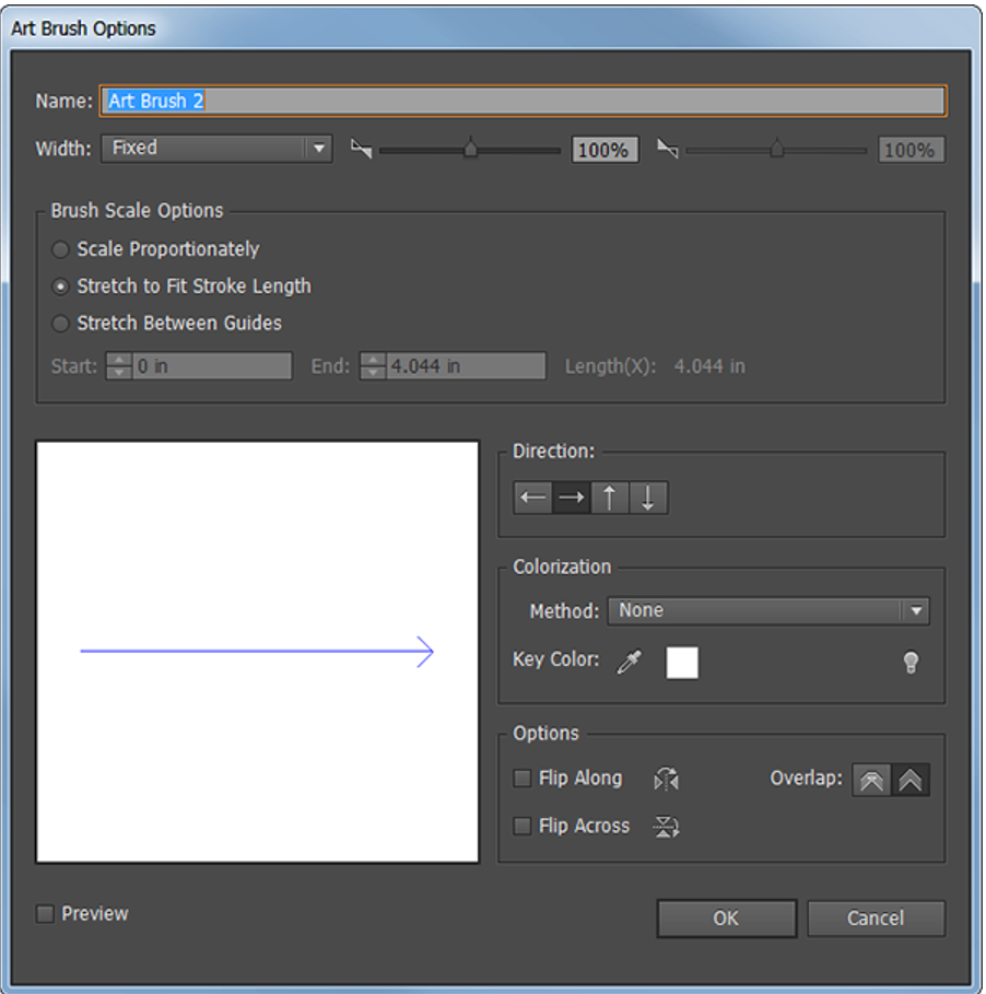
Step 5
Select the new shape made in Step 4, and in the Brushes panel, go to Options and hit Make New Brush. Select Art Brush and the panel seen below should pop up. These should be the default options. Hit OK. You now have a custom art brush ready to be used in the next step.
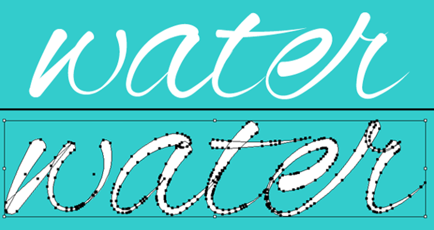
Step 6
Using the Paintbrush Tool (B) trace the letters in your word. In the case seen below, I’ve made sure my strokes begin at the thicker points of each letter and follow them accordingly. There are 12 strokes total for my word “water”. Once satisfied, go to Object>Expand Appearance in order to expand the paintbrush strokes into objects.
Step 7
Select each expanded shape and apply a Linear Gradient, using the Gradient Tool, that goes from White at 100% Opacity to White at 0% Opacity. Adjust the angle of the gradient with the Gradient Tool so the opaque white is concentrated at the thickest part of the shape and the transparent color at the thinnest.
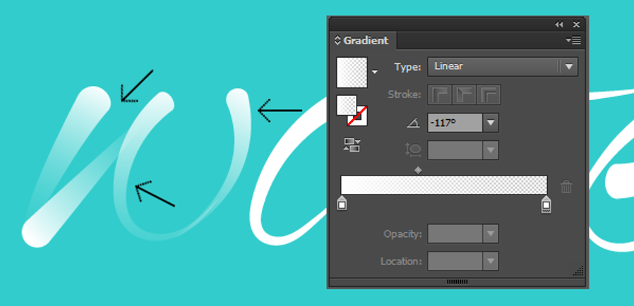
Step 8
Repeat Step 6‘s process for all of the shapes within your word.

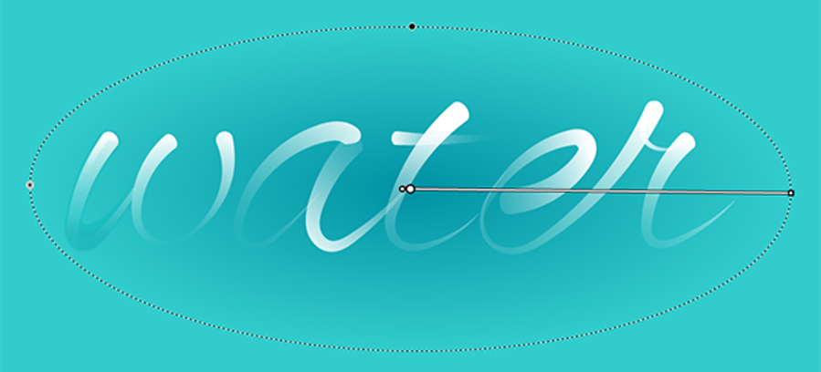
Step 9
Let’s make the background a little more interesting. Using the Gradient Tool and Gradient Palette , apply a Radial Gradient to the rectangle drawn in Step 1. This one goes from Dark Teal(R1, G147, B164) to Teal (R51, G204, B204). With the Gradient Tool, adjust the shape of the radial gradient so that it’s oblong and centered around your text.
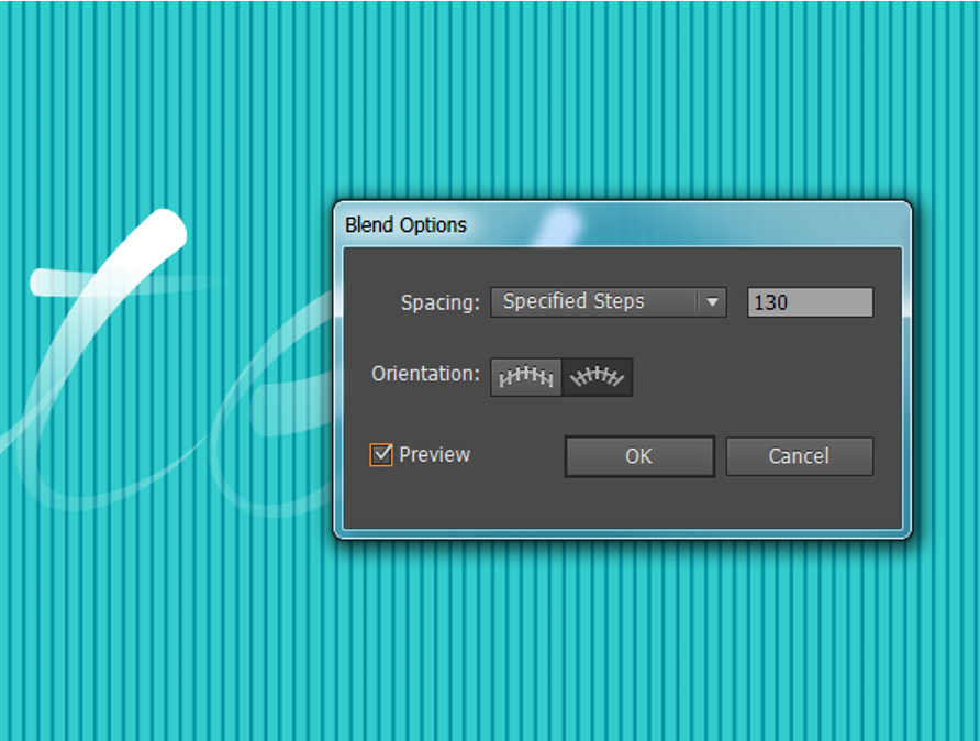
Step 10
In order to make it a striped background, use the Line Segment Tool (\) to draw a vertical line on the left side of the artboard. Copy (Control-C) and Paste (Control-V) this line and move it to the right side of the artboard. Align both lines with each other by selecting them and hitting any of the Vertical Align options in the Align panel (the three options to the right in the top row). Once aligned, select both and use the Blend Tool to apply a blend of 130 Steps or so (this depends on how many stripes you’d like in your background).
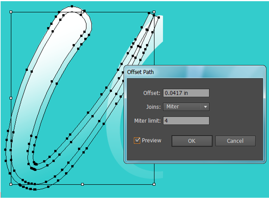
Step 11a
Now that the background has been sorted (Steps 10-11), let’s get back to the main text. Group (Control-G) together your letter components and Copy and Paste them. Hide the original group in the Layers panel, as you won’t need it at this time. Ungroup (this was done just for organization’s sake), Select the first part of the first letter (see below for the first leg of the W). Go to Object>Path>Offset Path and input -2px or -4px, depending on how small you’d like the offset shape to be.
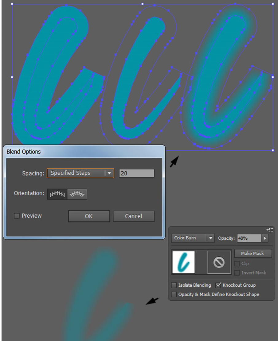
Step 11b
I’ve isolated the leg of the W from Step 10 so this process is easier to see. Change the fill color to the Dark Teal from Step 8. Reduce the Opacity of the larger shape to 0% in the Transparencypanel. Select both shapes and use the Blend Tool to create a smooth blend of 20 Steps. Select your newly made Blend Group and reduce its overall Opacity to 40% and Blend Mode to Color Burn in the Transparency panel.
Step 12
Repeat the process of offsetting shapes from Step 10 and the entire process of Step 11 on the rest of your text objects. Group these shapes together and unhide the text group from Step 10 in the Layers panel.

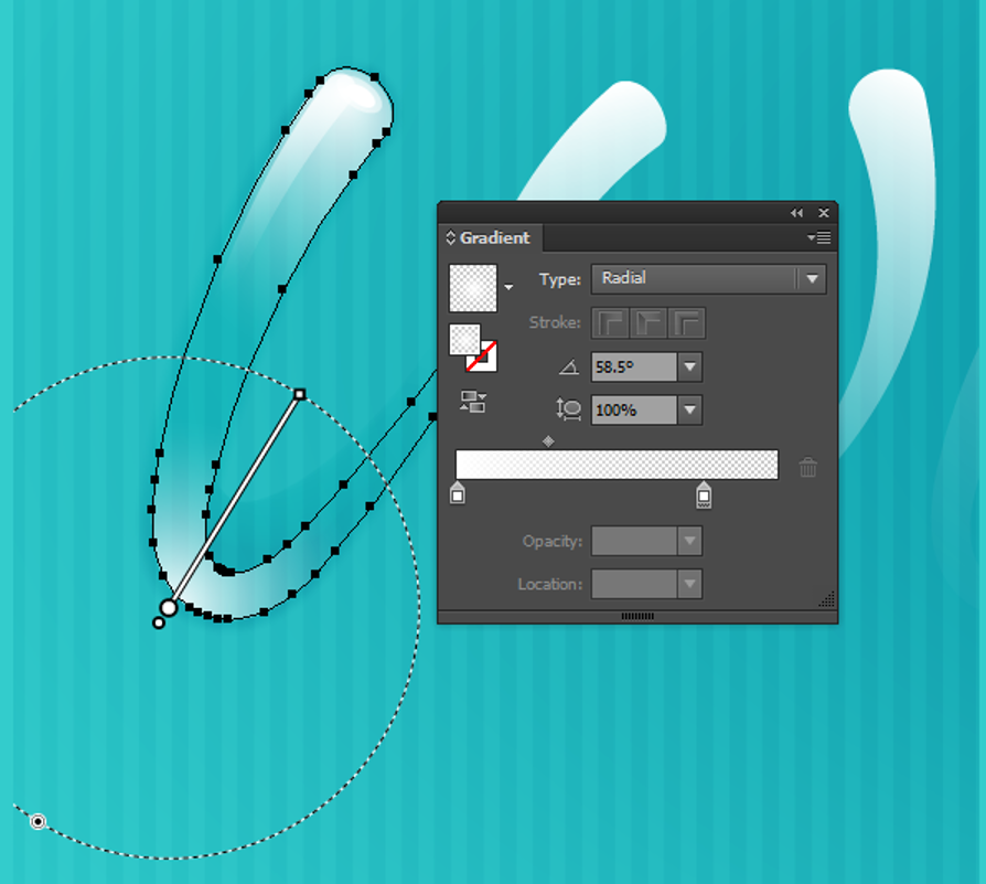
Step 13
In order to add additional highlights to the text as seen in the image in Step 12, Copy and Paste each leg and curved component of your letters, and apply a Radial Gradient with the Gradient Tool to the lower curves (see below) going from white at 100% Opacity to white at 0% Opacity. Repeat on the other letters where applicable (anything with curved shapes on the bottom). In the case of my text, I added seven additional gradient shapes. Group these extra shapes together.
Step 14
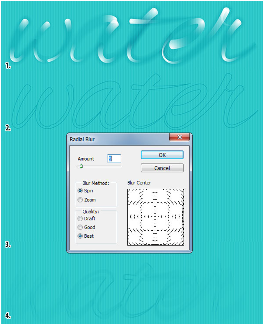
The next two steps involve three layers of additional text effects. Copy and Paste your text and Unite the copied text in the Pathfinder panel. Set the fill color to Null and the stroke color to Dark Teal (Step 10). In the Stroke panel, set the weight to 1pt and the cap and corner to Rounded. Select the outlined text and go to Effect/Blur/Radial Blur. Set the Amount to 9, Blur Method to Spin, and Quality to Best. This layer will be set above the other three groups that make up your text (see 1. below).
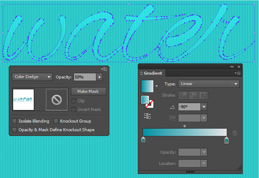
Step 15
For the second layer Paste the United text again and set the stroke color to null and the fill color to a Linear Gradient going from Dark Teal at 100% to Dark Teal at 0%. In the Gradient panel, set the angle to -90°. In the Transparency panel, set the Opacity to 50% and the Blend Mode to Color Dodge.
Step 16
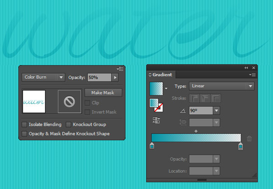
For the last layer, Paste the United text again, and set the stroke color to null. Using the Gradient panel, set the fill color to a Linear Gradient going from Dark Teal at 100% to Dark Tealat 0% and set the angle to 90°. In the Transparency panel, set the Opacity to 50% and the Blend Mode to Color Burn.
Step 17
Group together all of your text groups and new layers made up to this point.

Step 18
In order to make simple water drops, as seen below, check out the following process:
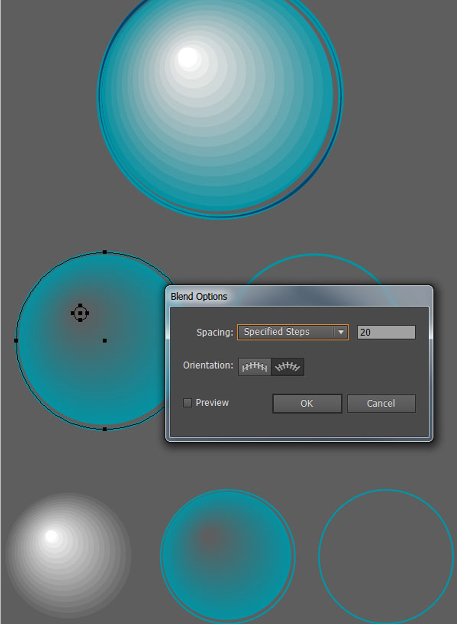
- Using the Ellipse Tool , draw a circle. Draw a second, smaller circle inside of the first. The larger circle should be Dark Teal at 100% Opacity and the second, small circle should be Dark Teal at 0% Opacity.
- Select both, and with the Blend Tool, specify 20 Steps for a smooth blend between the two.
- Copy and Paste the Blend Group and change the smaller circle’s color to White at 100% Opacity and the larger circle’s color to White at 0% Opacity.
- Copy and Paste the larger circle and set the fill color to Null and the stroke color to Dark Teal at 1pt weight. In the Transparency panel, set the Blend Mode to Color Burn.
Step 19
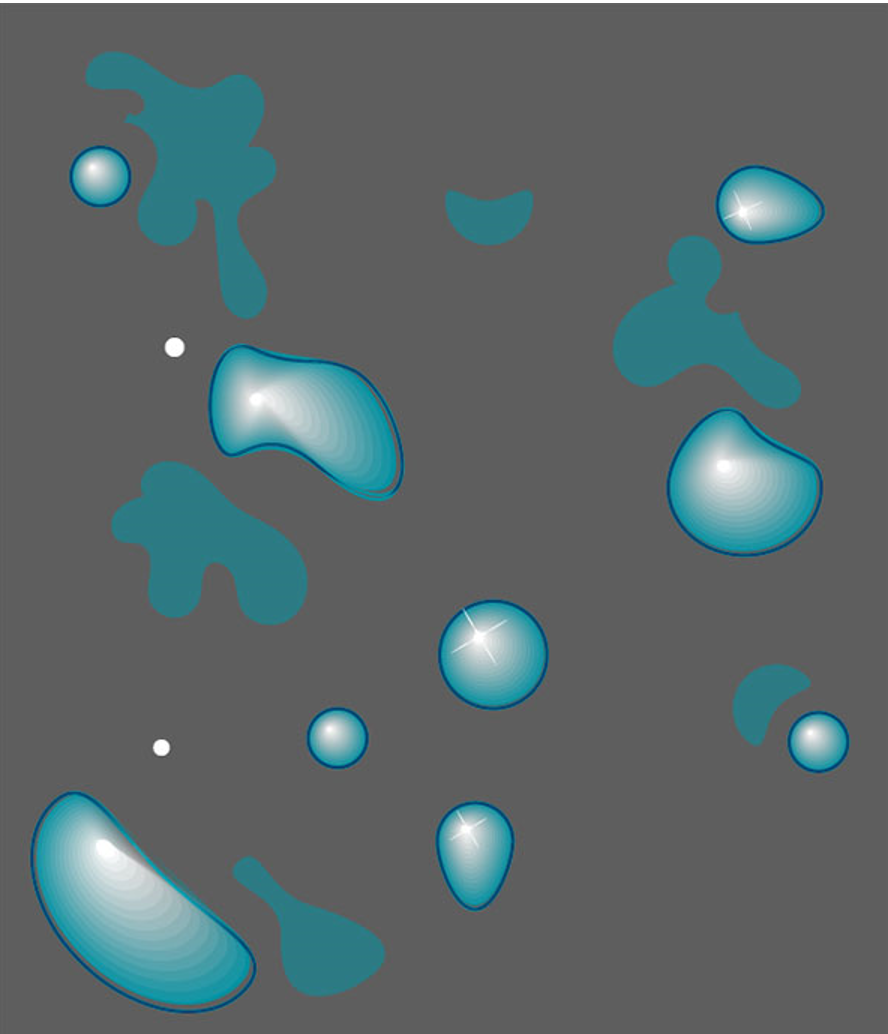
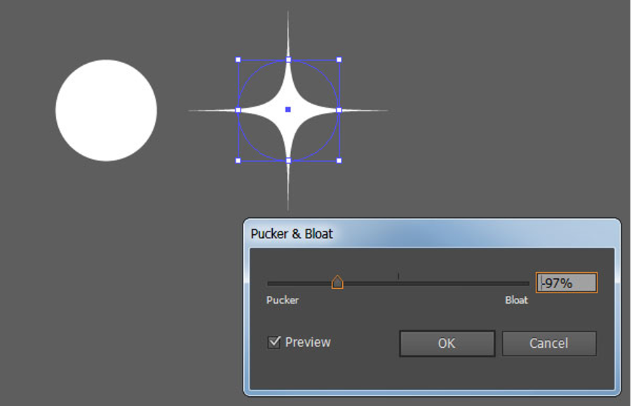
Repeat Step 17 with manipulated circles (do so by pulling anchor points outward, pushing them inward, or manipulating the handles of the anchor points with the Direct Selection Tool). Draw splash shapes with the Pencil Tool (N), and create sparkles by drawing small circles with theEllipse Tool and going to Effects/Pucker & Bloat and setting the slider to -97% or so. These shapes will be scattered around the main water text.
Step 20
Draw splash-like shapes on either side of your text with the Pencil Tool. In case you’re not using a tablet to draw, you’ll find you have more control with the Pen Tool in creating curved shapes. The aim of this step is to draw curves aiming outward from the text; as though the letters are splashing water to the sides of the picture plane. Set the fill color to Dark Teal and reduce the Opacity to 60% in the Transparency panel.

Step 21
Much like the text, there’s multiple layers needed for the splash shapes on the sides. Grouptogether the shapes drawn in Step 19. Copy and Paste them. Using the Color Panel, set the fill color of the top copied group to null and the stroke to Dark Teal; then set the stroke to 1pt (or less, if you’d rather) in the Strokes panel. Next using the Appearance panel, set the Blend Modeto Color Burn. Paste three additional layers of the copied group and follow the same process from steps 13-15 for each of them. Group these splash shapes together.
Step 22
Repeat Step 20 with the splashy shapes on the other side.

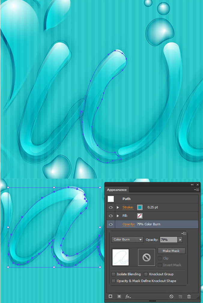
Step 23
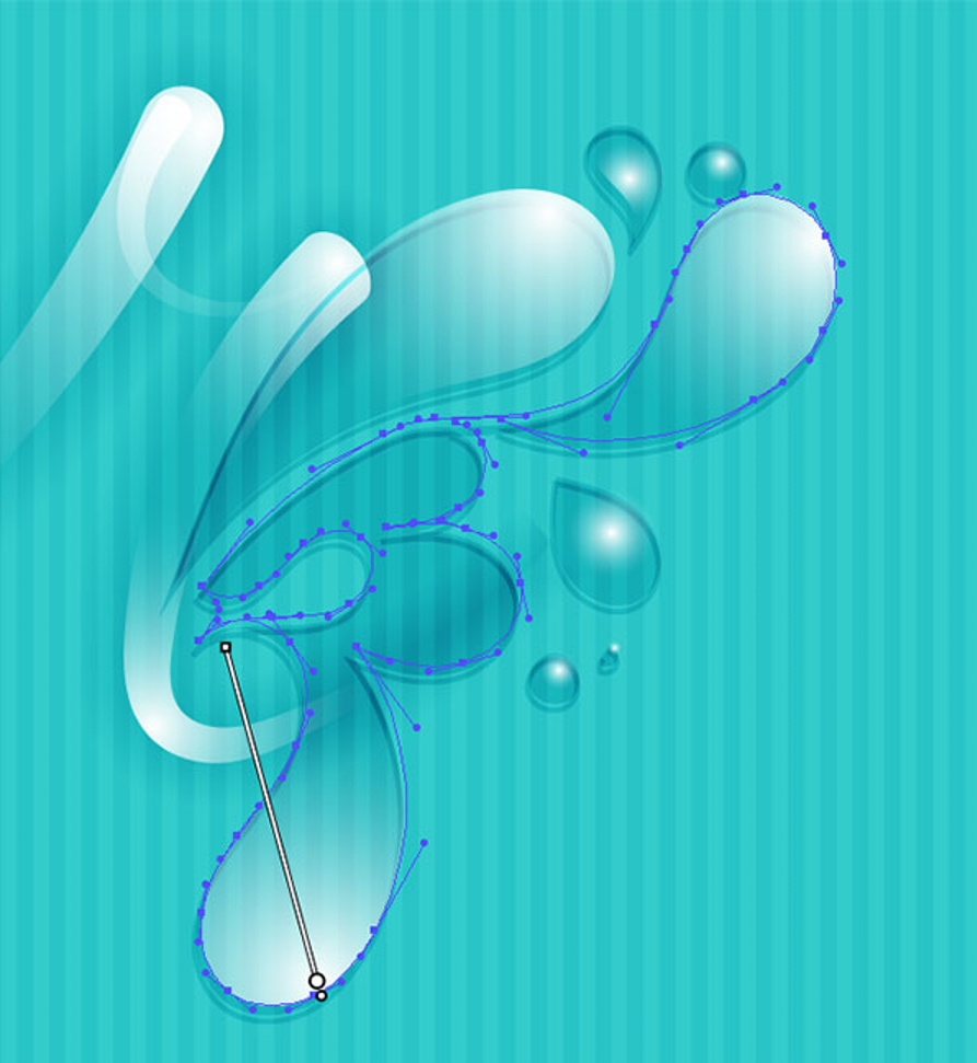
Place the water droplets made in Steps 17-18 around the text as you see fit. With the Pencil Tool, outline the text in a series of pieces (see below). The aim is to make liquid-like, wiggly shapes. Hit Enter with the Pencil Tool selected and when the dialog box for the tool’s options pops up, set the Fidelity to Accurate by bringing the slider (at the top of the box) all the way to the left. If you’re working with a mouse, you may wish to change this to something closer to smooth in case your lines aren’t as accurate as those drawn with a graphics tablet. Make sure the fill color is set to Null and the stroke color is set to Dark Teal (as used throughout this tutorial). I’ve set the weight to 0.25pt in the Stroke panel and reduced the Opacity to 79% with the Blend Mode set to Color Burn in the Transparency panel. Repeat this throughout your text.
Great job, you’re done!
Group together your text, splash shapes, and water droplets. You can add additional sparkles, render the splash shapes like the water droplets, or push the text further with additional layers of gradient shapes, shadows, and highlights.