Colour
Colour
Color is one of the most obvious elements of design, for both the user and the designer. It can stand alone, as a background, or be applied to other elements, like lines, shapes, textures or typography. Color creates a mood within the piece and tells a story about the brand. Every color says something different, and combinations can alter that impression further.
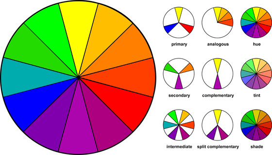
Primary Colors: Red, yellow and blue
In traditional color theory (used in paint and pigments), primary colors are the 3 pigment colors that can not be mixed or formed by any combination of other colors. All other colors are derived from these 3 hues.Secondary Colors: Green, orange and purple
These are the colors formed by mixing the primary colors.
Tertiary Colors: Yellow-orange, red-orange, red-purple, blue-purple, blue-green & yellow-green
These are the colors formed by mixing a primary and a secondary color. That's why the hue is a two word name, such as blue-green, red-violet, and yellow-orange.Color Harmony
Harmony can be defined as a pleasing arrangement of parts, whether it be music, poetry, color, or even an dessert. Harmony is a dynamic equilibrium.
In visual experiences, harmony is something that is pleasing to the eye. It engages the viewer and it creates an inner sense of order, a balance in the visual experience. When something is not harmonious, it's either boring or chaotic. At one extreme is a visual experience that is so bland that the viewer is not engaged. The human brain will reject under-stimulating information. At the other extreme is a visual experience that is so overdone, so chaotic that the viewer can't stand to look at it. The human brain rejects what it can not organize, what it can not understand. The visual task requires that we present a logical structure. Color harmony delivers visual interest and a sense of order.
Extreme unity leads to under-stimulation, extreme complexity leads to over-stimulation.Some Formulas for Color Harmony:
There are many theories for harmony. The following illustrations and descriptions present some basic formulas.
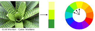
1. A color scheme based on analogous colors
Analogous colors are any three colors which are side by side on a 12 part color wheel, such as yellow-green, yellow, and yellow-orange. Usually one of the three colors predominates.
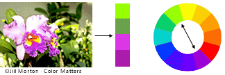
2. A color scheme based on complementary colors
Complementary colors are any two colors which are directly opposite each other, such as red and green and red-purple and yellow-green. In the illustration above, there are several variations of yellow-green in the leaves and several variations of red-purple in the orchid. These opposing colors create maximum contrast and maximum stability.
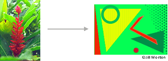
3. A color scheme based on nature
Nature provides a perfect departure point for color harmony. In the illustration above, red yellow and green create a harmonious design, regardless of whether this combination fits into a technical formula for color harmony.
Line Colour Shapes Space Texture Typography Scale/Size Dominance Balance Harmony Main